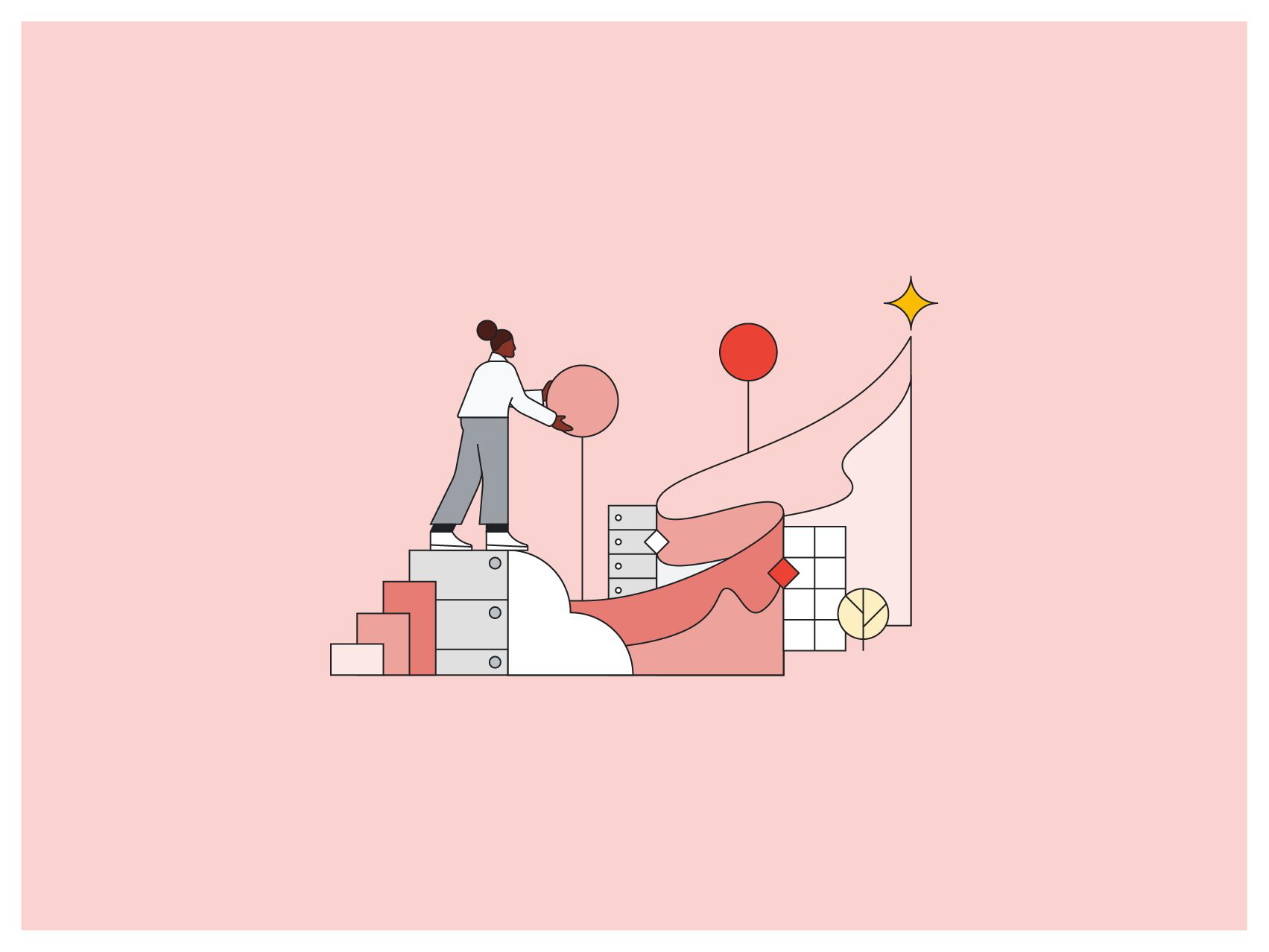
"Growth" hero illustration by Rose Wong
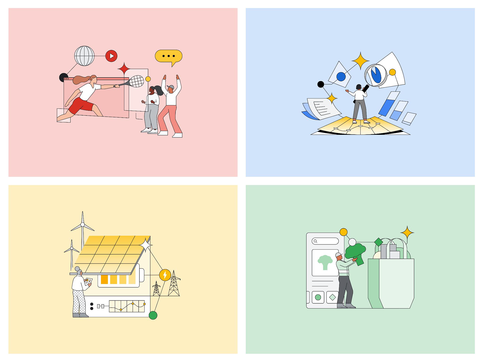
Not gonna lie. Leading the development and execution of a global illustration system for Google Cloud was a wild ride! The ecosystem had over 10 different illustration styles, confusing for producers and users. I created a new system that is consistent, cohesive, flexible, adaptable, and visually appealing, helping Google Cloud stand out as a brand.
The first step to securing budget and resources was to develop a point of view that addressed the need for the illustration system. I needed to prove why it was essential, so I created a roadmap with three main goals:
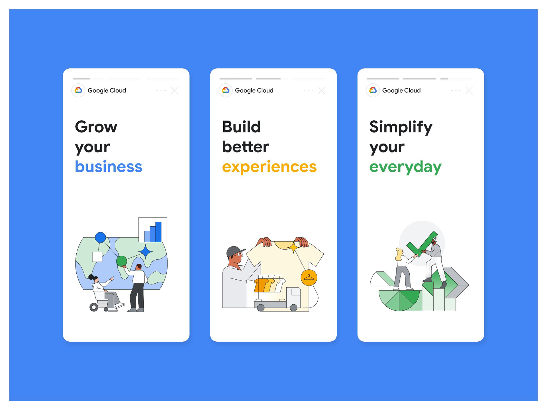
Improved communication: Made information more engaging and easier to understand for partners and customers.
Increased brand awareness: Created a stronger and more united visual identity for Google Cloud.
Enhanced user experience: Made Google Cloud's products and services more cohesive and trustworthy.
Increased brand awareness: Created a stronger and more united visual identity for Google Cloud.
Enhanced user experience: Made Google Cloud's products and services more cohesive and trustworthy.
The illustration system was informed by three principles from the parent brand.
1. Focus on solutions 2. Build for everyone 3. Keep it simple
The illustration style had to sync with Google Cloud's rebranding so I worked with other leads to onboard agencies and partners to the new look and feel, and created a best practices guide to align illustration expressions globally.

This helped regional marketers create localized content without using stock photos, but we needed to simplify the basis for new illustrations while we worked on the next phase. I broke it into 3 components: concept, figure and style.
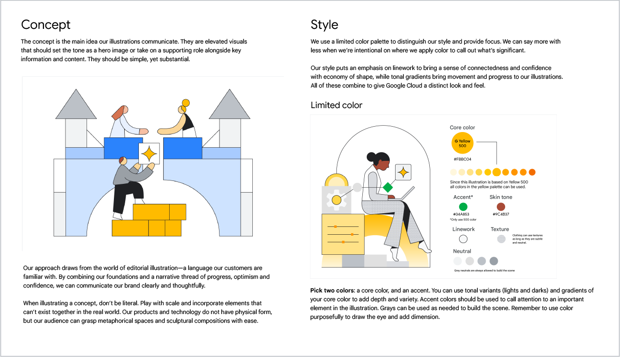
Concept borrowed from editorial illustration and build on our foundation of connection, progress, and confidence to communicate clearly, incorporating elements that are impossible in the real world.
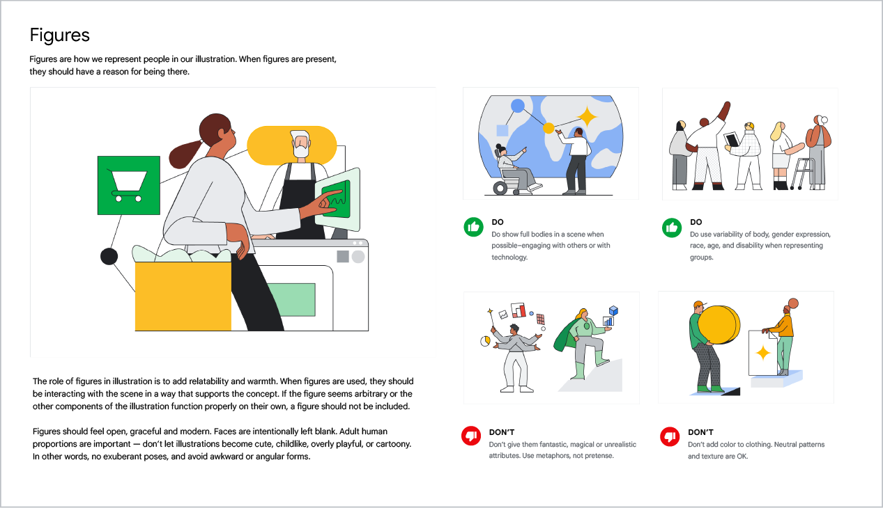
Figures need agency. When characters are present, they are the main focus. Give them a purpose, and don't just include them for the sake of it.
Style consisted of a limited color palette, for focus and direction, linework conveys connectedness and confidence, while gradients bring progress.
Figures need agency. When characters are present, they are the main focus. Give them a purpose, and don't just include them for the sake of it.
Style consisted of a limited color palette, for focus and direction, linework conveys connectedness and confidence, while gradients bring progress.

The guide was published internally and added more examples to influence the convergence of style into a more ownable expression for our B2B marketing.
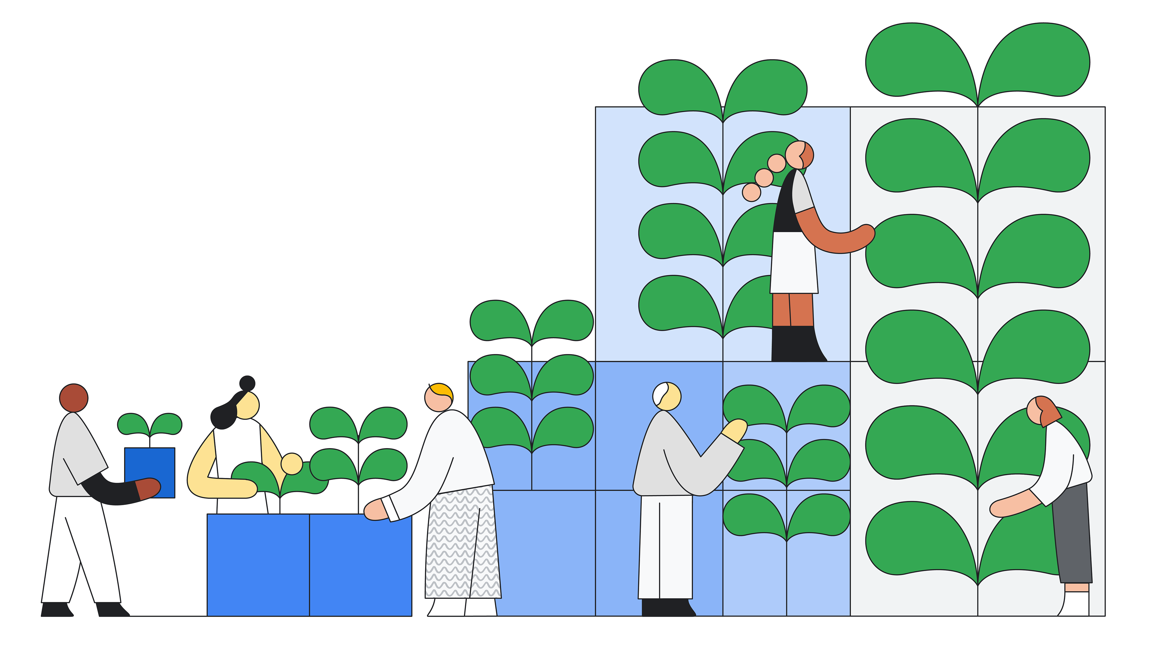
The second phase was to build our own house-style, asset library, based on the already existing guidance. That way, I can pressure test across applications. I expected some challenges to rise so we could further refine the guidance attributes if needed. This hands-on creation process allowed me to highlight the details we will need to be documented and amended in style guides and rules.
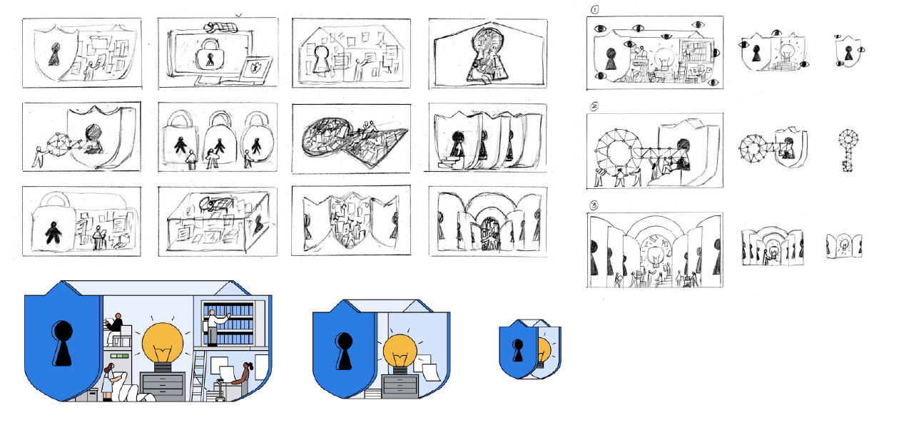
Security illustration process by Rose Wong

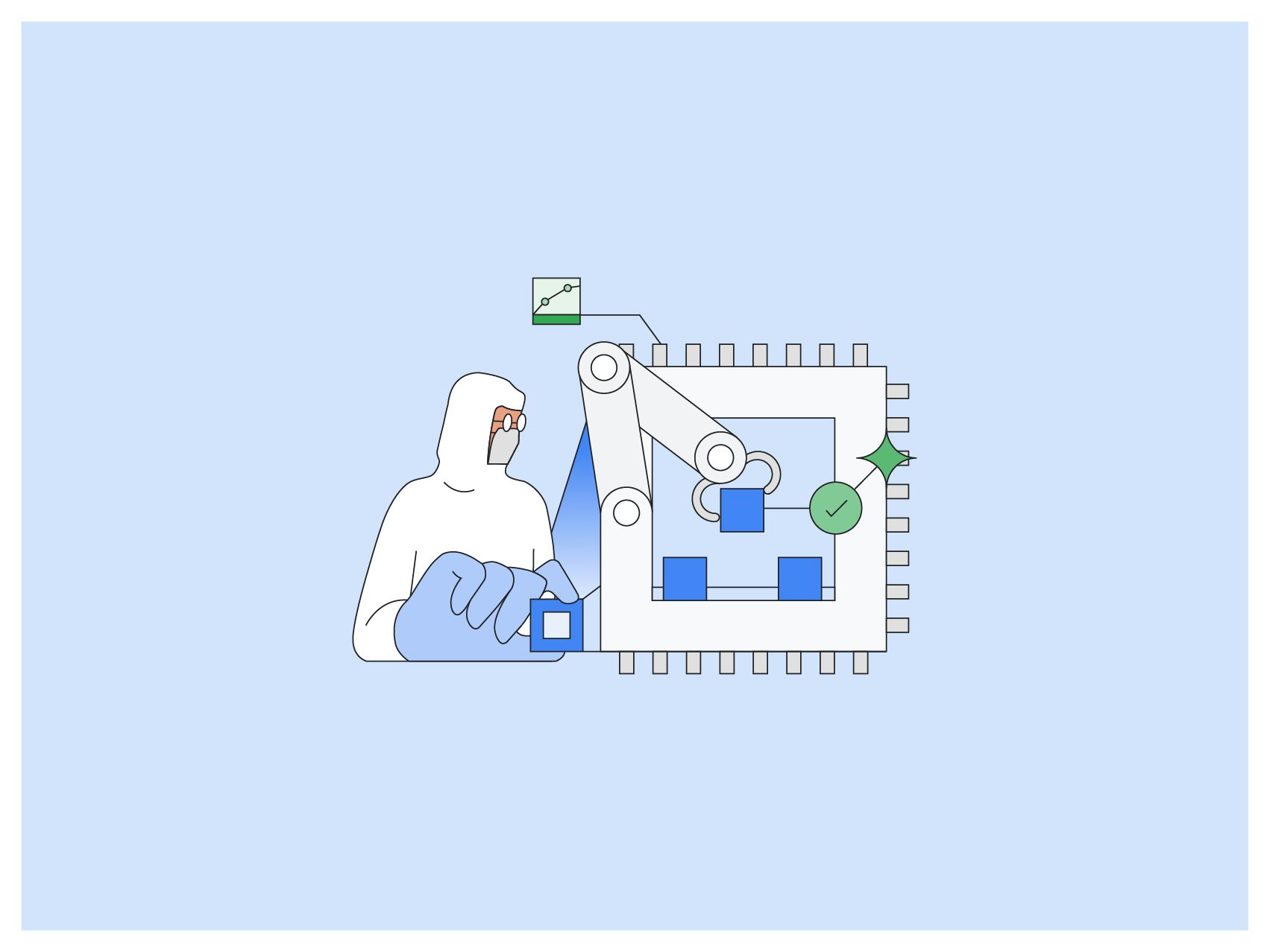
Manufacturing illustration process by Chris DeLorenzo
To maximize our resources, I used a mix of independent illustrators and agencies. As an experienced illustrator, I managed creative development internally. We worked with leadership and subject matter experts to define what we should be illustrating through themes and industries. I then rewrote these definitions to be concise and clear. With their help, I set up milestones with my team and the talented illustrators.
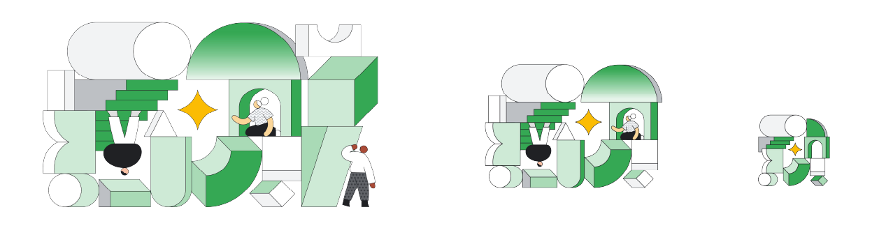
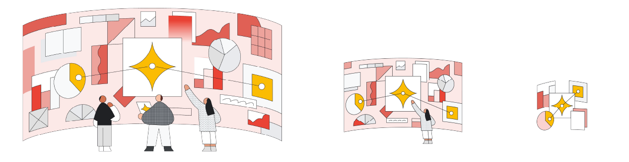
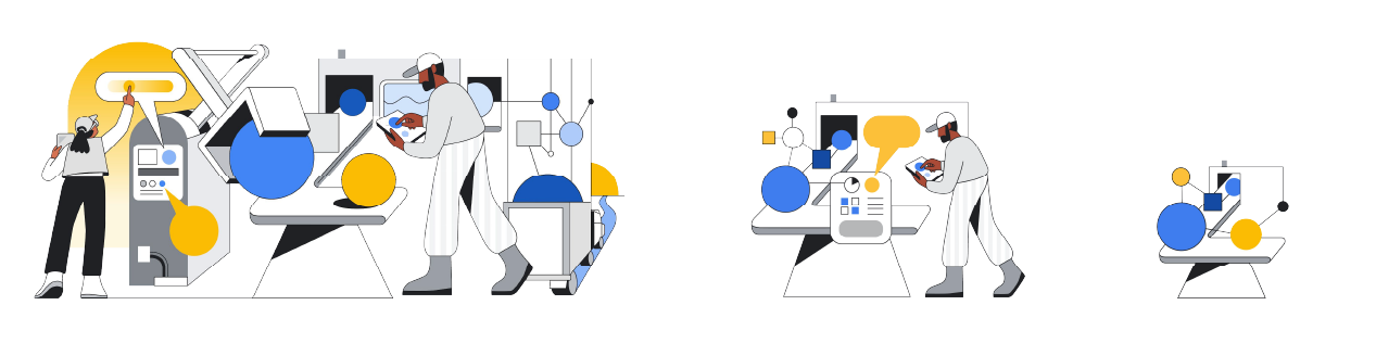
I asked the illustrators to complete one idea and scale it down to 3 different ratios: a hero, a spot, and an icon. Giving us more options for different surfaces and applications.
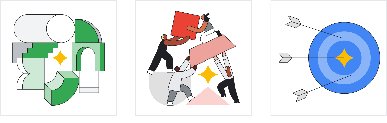
With the help of many amazing collaborators and supporters, I created a popular, inclusive illustration library for Google Cloud marketers. Over 72% of internal teams gave it positive feedback, and we received over 700 requests for usage. On our last phase, I contracted the Apparent agency and with the established rules, we released a second batch with over 90 illustrations, updated the library and identified common gaps in execution by updating the guidelines.
Additional illustrations created by Apparent
The library empowers marketers to find creative solutions and helps teams go to market quickly. With many moving parts, it was impossible to control everything, so I designed a self-sustaining process with eager stewards who help push the look and feel.